Tailwind CSS

My Learning towards CSS frameworks
CSS Frameworks are also known as CSS libraries which are used to simplify styling of a webpage. These libraries helps us to write CSS faster. Some of the CSS Frameworks are:
Bootstrap
Tailwind CSS
In this article we are going to discuss about Tailwind CSS ,one of the majorly used CSS Frameworks.
Tailwind CSS
Tailwind CSS is known as a utility first CSS Framework. Tailwind CSS has predefined classes which are to be written in the html markup. These classes(like flex, justify-between, bg, spacing) style the document without requirement writing CSS. It can make the website responsive.
Installation
Using this below CDN Link in our HTML head we can start working with Tailwind CSS.
<script src="https://cdn.tailwindcss.com"></script>
Customize
By editing Tailwind.config Object in head of HTML, we can customize with our own design tokens.
<script>
    tailwind.config = {
      theme: {
        extend: {
          colors: {
            clifford: '#da373d',
          }
        }
      }
    }
  </script>
Utility First
Traditionally while developing a basic page in web development, we write HTML code, to that HTML code we will add classes so that we can apply CSS and design website.But in Tailwind CSS we will be using
pre existing classesand apply that to our HTML.
Let us learn the core concepts by styling a webpage.

Style the Heading
<body>
    <nav class="container bg-blue p-8 mx-auto " >
        <div class="flex items-center justify-center">
            <div class="pt-1">
                <img src="https://web.learncodeonline.in/_next/image?url=%2FAssets%2FLogos%2Flogo.svg&w=96&q=75" alt="Logo" class="w-30">
            </div>
          </div>

    </nav>
</body>
OUTPUT:

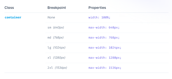
Container
A component for fixing an element's width to the current breakpoint.
Background Color
Here, we defined a class in the body tag as class="bg-blue". bg is a predefined class for background color. It changes the background color to blue.
Padding
Utilities for controlling an element's padding.
In the above example we have given class="p-8" p is a predefined class for padding
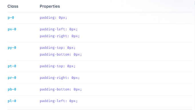
Add padding to a single side Control the padding on one side of an element using the p{t|r|b|l}-{size} utilities.
Margin
Utilities for controlling an element's margin.
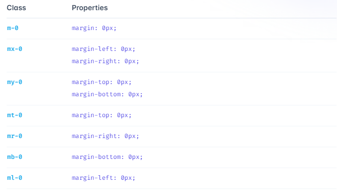
In the above example we have given margin as mx-auto which is same like margin-left:auto and margin-right:auto
FLEX
Utilities for controlling how flex items both grow and shrink.
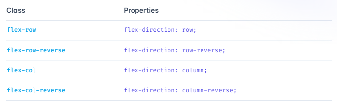
Flex Direction
Utilities for controlling the direction of flex items.
Justify Content
Utilities for controlling how flex and grid items are positioned along a container's main axis.
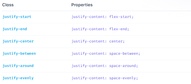
In the above example we have use
justify-centerWhich is same as justify-content: center
Align Items
Utilities for controlling how flex and grid items are positioned along a container's cross axis.
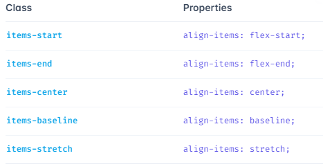
In the above example we have use
align-centerWhich is same as align-items: center
Lets learn about responsive section

This section consists of content on left and image on right for screens of size md and wider. For screens of size sm ,the image goes on top of the content. Let us look at the code snippet to understand this better.
<div class="container bg-gray-900 pt-16 flex flex-col-reverse items-center md:flex-row mx-auto md:space-x-6">
md:flex-row mx-auto md:space-x-6 These classes displays the flex with a flex-direction-row for screens of size medium and wider.
flex flex-col-reverse items-center -These classes arranges the image and content with a flex direction of column-reverse and align the items to the center for small screens

GRID
Utilities for specifying the columns in a grid layout.
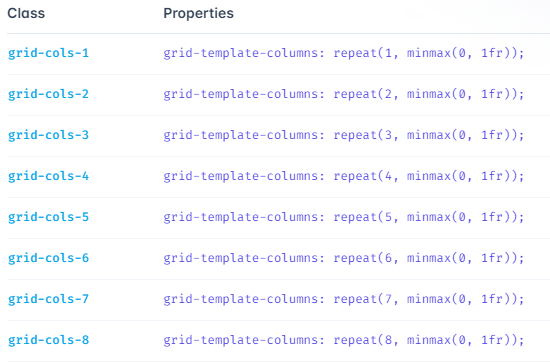
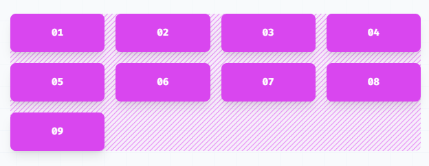
<div class="grid grid-cols-4 gap-4">
  <div>01</div>
  <!-- ... -->
  <div>09</div>
</div>
OUTPUT
GAP
Utilities for controlling gutters between grid and flexbox items.
Example:
class="gap-2"
to change the gap between both rows and columns in grid and flexbox layouts.
CONCLUSION
Tailwind CSS is highly customizable. It is easy to use and speeds up the creation and design process in the long run.
I hope this article has added value to your time.


